The home is where the heart is. Not just because it is a built place
for hearth but because of the family that makes up that home. This is why many
are investing so much for such a place since it is a place of love, comfort,
communication, and family. If you’re a new homeowner like us (Lancaster New
City c/o ProFriends), you could
be as excited as we were when we first got our home but have you thought about
the interior of all rooms? If not, allow me to help you with that. Here are
some great home designs I found. Enjoy! J
This first one I found on Google immediately caught my eye since I like
purple/lilac/violet and any other similar shade. It’s my second-favorite color.
The lines and lighting on this one are great, too. The combination with white
makes it even brighter and inviting. It’s simple yet not quite. Tasteful
indeed.
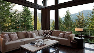
What’s better than a corner lounge sofa? One with a great view of
course! I’m in love with this! It reminds me of the Cullen house though. But
I am digging the dark brown colors and other earthly tones to match the nice
view.
This is very Japanese minimalist yet modern. It works for me even if
it’s all brown and wood. I’m into carpentry, remember? I think more men would
like such a room. It’s clean and a sight to see.
If only our home was this huge (I still love our new home though), then
maybe we could aim to have such a grand staircase. The color combination is
very reminiscent of Greece. This is very elegant and I know many will
appreciate such a sight when I have this in my home.
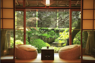
I really love anything Japanese! The people, the food (except sashimi
and anything with raw ingredients), the environment, the sights, and the
culture are so awesome. I always wanted to visit an old traditional Japanese
home. They usually have this kind of room that opens to the garden. I think
this is such a nice room to have in our home even if our home isn’t a Japanese
one. (Maybe I can convince my sister and mom to install/have such a room in our
home? Hmmm…)
I usally don’t like the kitchen to be so open since the smell of what’s
cooking (fish, bagoong, and other
strong smelling ingredient or dish) may spread all throughout the house. But I
really like this design though. It’s so clean and fresh-looking. Almost
everything is here except for the kitchen sink.. oh wait, it’s here.. and yet
everything works!
I guess this one is suitable for condo living? Not sure though but
having more place to seat and throw pillows in the kitchen kind of works for
me. At least people have more seating options in the kitchen.
Wow! This so cute! I know I’ll like this if I were still a kid. Just
change pink to green and yellow/orange to lilac though.
for more resources:
http://profriends.philippinesrealestatesites.com/
http://www.sunstar.com.ph/pampanga/local-news/2013/05/23/pro-friends-reaching-out-beyond-homes-283851
http://www.erecrerealestategroup.com/2012/02/property-company-of-friends-inc-or-pro.html


No comments:
Post a Comment